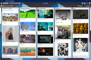
Inspiration


Back in May Antek and I participated in a local game jam organized by the Gamedev.js community. The jam's theme was Obstacles. In 8 hours we created Shape Ronin, a browser-based four-player game about matching shapes. We were both influenced by an amazing exhibition of Japanese ukiyo-e woodblock prints, Journey to Edo, which we had seen the day before. The idea was simple: players would play as Tetris-block-shaped ronins who race against time in order to fit through a hole in a wall. The game placed second. Seeing people play it and have fun with it was the best reward we could have hoped for. For the next few weeks we would meet with friends and casually play Shape Ronin together. It was exhilarating.
The jam was only 8 hours; some features didn't make the cut. Rotations, sprite animations, increasing difficulty and many more. I managed to implement rotations the week following the jam. Other features ended up being put off until some other time. And so when Microsoft announced The Dream.Build.Play Challenge 2017 we knew that it was the opportunity we'd been waiting for. We would re-make Shape Ronin.
I started by collecting a list of references for the art direction. The first batch was still inspired by the Japanese culture. I was particularly mesmerized by traditional Japanese kites, as documented by Masami Takakuwa on their website. Some designs, like Yakko and Rokkaku, would work very well in a shape matching game indeed!
Another inspiration also came from Japan: origami. The geometric nature of origami would lend itself well to the theme of arranging shapes on the screen. We also briefly considered switching to 3D which we'd been obsessing about for a few months at this point. Michał created a 3D renderer and a game engine from scratch and our last two games were 3D, too.
In the end we felt more comfortable in 2D. We knew we wanted to create a lot of good quality assets for this game. We're still beginners as far as 3D modelling and animation are concerned so it's better to stick to something we know well . We only have until the end of the year to launch the finished game.
We widened our search for inspiration beyond Japan. I started collecting references again. I grouped them into two buckets: Inspiration and Anti-Inspiration. The latter one was a compilation of images and screenshots of games that we liked and enjoyed but that we didn't want to draw inspiration from this time. Sometimes it's important to get everyone on the same page about what we are not working on.
This turned out to be a helpful exercise. We ruled out styles which based on lights and shadows, 2.5D graphics, rich background art and dark and grim story-telling. Our go-to inspirations ended up being minimalist and abstract with bold foreground colors and easy-to-follow motion. And with just enough whimsy to make Antek feel right at home.
Blocks with Attitude
A shape matching party game for 4 players.
| Status | Released |
| Author | Piesku.com |
| Genre | Puzzle |
| Tags | Co-op, Endless, Local Co-Op, party-game |
| Languages | English |
More posts
- The Search for NarrativeNov 02, 2017
Leave a comment
Log in with itch.io to leave a comment.