js13k part 2: Game Design
Millennials is a roguelike deckbuilding card game. Let's break down what it means, also noting the deviations from the cannon of the genre.
It's a card game, and thus a card is the basic game object around which everything revolves. Cards represent characters who have an energy cost and a power value. Cards can also have abilities. Some abilities are actions; they happen once when the card is revealed. Other abilities are effects (they apply as long as the source card is in play) and triggered abilities which happen when a specific condition is met. The player has a deck of cards from which they draw cards into the hand each turn.
In contrast to many popular deckbuilding card games, the hand in Millennials is persistent, i.e. it isn't discarded at the end of the turn. There's much less rotation of cards in hand, and the risk of not drawing a particular card at all during a single battle is relatively high. Once played, cards remain on the table until the end of the battle (unless trashed by another card or location). This is also different from most deckbuilders, in which cards represent actions and do not persist between turns.
It's a deckbuilder, and thus the core game play loop is designed around winning card battles which reward the player with opportunities to improve their deck. There are many more cards to be acquired than the starting cards. Improving the deck is necessary to be able to face the opponents at later stages of the game.
Unlike most deckbuilding card games, you acquire new cards only by replacing an existing card with the new one. Your deck always has 12 cards. You don't need to trim the deck when it grows too big nor do you need to build a draw engine to counter the deck's sprawl. However, you do need to make hard decisions and trade-offs when exchanging cards—which ones can your build survive without?
Finally, Millennials is a roguelike. The sequence of battles is different for each run, losing a battle loses the run, and the meta-progression (learning the game across multiple, often failed, runs) is as important to winning as building a good deck.
What makes Millennials different from other deckbuilding roguelikes that we know of is the lack of a map on which you travel and choose encounters, and the fact that the opponents are subject to the same rules as the player: they have their own decks, they draw up to seven cards in hand, they gain energy the same way the player does, etc.
Early Iterations
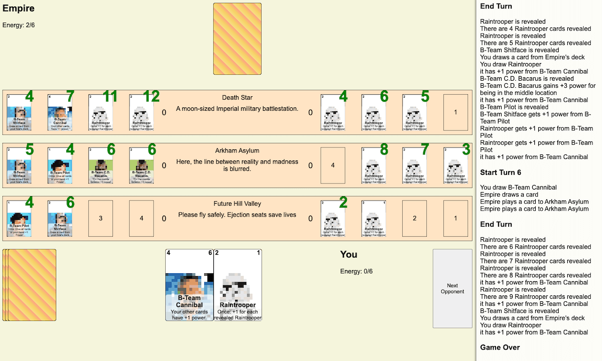
Our first iteration was largely based on the design we tested in Lunapark. Battles took place across three locations, laid out in a column. On each side a single location there were four slots where players could play cards. Cards had a cost, a value and—crucially—an operator: either ADD or MUL. The order of cards played into a location's slots thus mattered greatly: you really want to play your MUL cards into the last spot to make the most out of them.
The first iteration of Millennials, featuring distinct slots that cards could be played into. Some cards had multipler effects, making the order of cards in a location significant.
We liked this pipelined design for its explicit ability to produce large numbers, and also because it created competition for the third and the fourth slot—in Lunapark one of the opponents was able to play cards on the player's side of a location to take up those valuable positions. At the same time, it made defining some other game mechanics more difficult. For example, if a card adds +1 power to other cards in this location, does that only apply to ADD cards, or both ADD and MUL cards? If it's the latter, then balancing such effects become much more challenging.
Explaning all the rules of this design would be difficult. We also felt that the 12 slots in 3 locations added to the cognitive complexity for first-time players. On turn one, the player is expected to choose a slot to play a card, i.e. to make 12 distinct decisions. Which slot it the best?
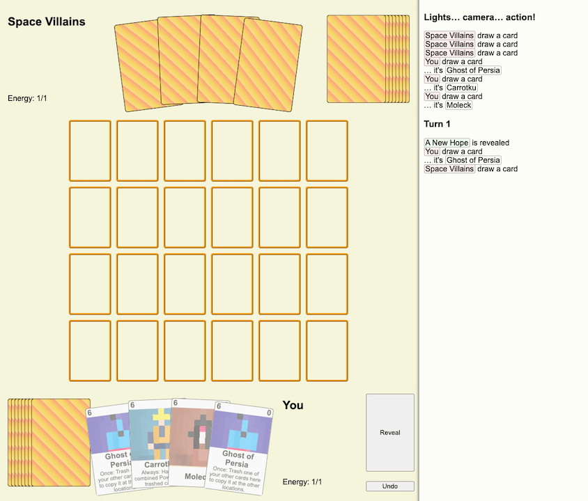
A rough prototype of the battlefield being a grid. Locations are not pictured but we considered placing them randomly in the grid's cells; they would affect cards in the same row, column, or within a radius.
We started looking for other ideas. One alternative that we considered was leaning into the slotted design and making the battlefield a proper grid, like in chess. Locations would be placed randomly on the grid and affect cards in the same row, column, or within a radius. It would create a sort of topology for the battle. Perhaps it would be possible to play cards anywhere in the landscape, which opened new possibilities for cards and game mechanics working behind the enemy lines.
All of this felt very exciting. However, it was already September. We had designed around 40 cards at this point—and there was still a lot of work ahead of us. We decided to table this idea for after the jam.
Side by Side
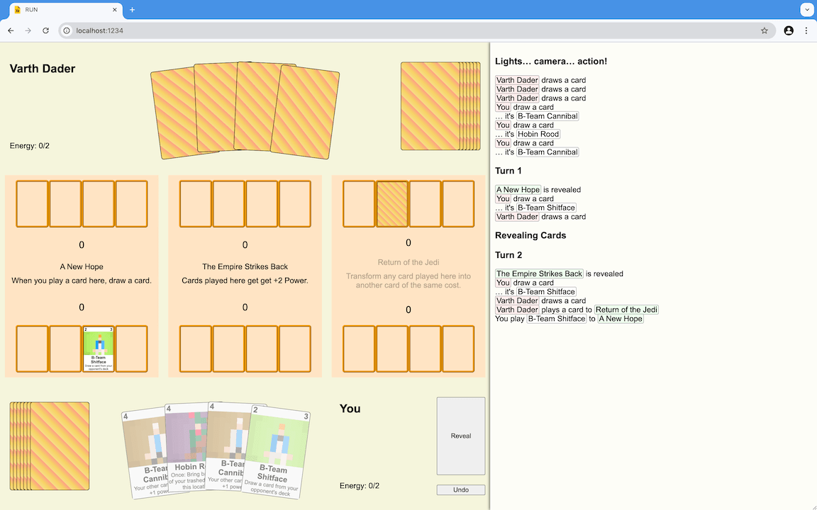
We went back to three distinct locations in our final design. This time, we laid them out in a row, for consistency with how the opponent's hand is at the top of the screen, and the player's hand is on the bottom. We also dropped slots, significant order, and MUL cards. There's only one card left in the final design of the game, Ron Jambo, which doubles the power at the current location—regardless of its position. It's implemeted as a one-off if.
An almost-final design of the battle: three locations laid out side by side. You can still see explicit slots in locations; we dropped them soon after this screenshot was taken.
Each location has a unique effect, which activates on turn 1, 2, or 3. There are 18 locations, and they are picked randomly for each battle, for a total of 816 possible battlegrounds. The effects vary from quite subtle to completely game-changing, for example:
- When you play a card here, draw a card.
- If you have no cards here at the start of a turn, gain +1 energy.
- Cards played here fill the location with their copies.
- This battle has an extra turn.
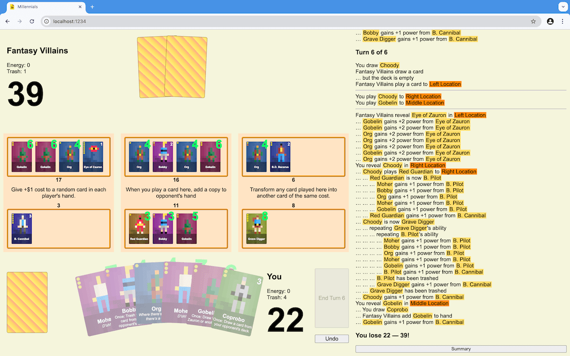
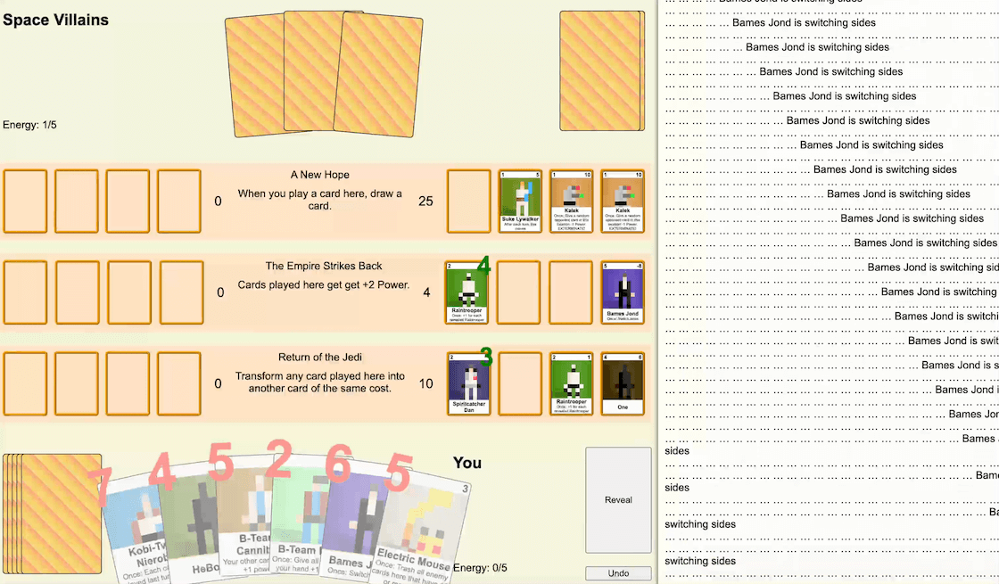
Just look at the beautiful log and the Choody/Grave Digger combo!
Battles in Millennials take 6 turns. Each turn you get one more energy point to spend, similar to how Hearthstone does it. The energy supply is predictable, making mana floods and mana screws less common than in most other card games.
All cards represent fictional characters and most cards have special abilities which either activate once the card is revealed, or are in effect as long as the card is in play. Some effects are triggered by events, like another card being revealed or trashed, or a particular turn starting or ending.
In order to manage the complexity of the design space, as well as that of the implementation, we established a vocabulary of our game mechanics. Cards are drawn from the deck into the hand; played onto the table, then revealed; they can move between locations or between owners; they can be trashed or transformed into another card.
Take Choody's ability for example: Once: Play the top card of your deck here. Choody adds a card from the player's deck onto the table for free, making him a good ramp for more expensive cards. The wording is important, though: Choody plays the top card, which means that it triggers other abilities that listen to cards being played. If Choody is played to the location which reads: When you play a card here, add a copy to opponent's hand, then both Choody and the card played by Choody will be added to the opponent's hand (provided there's enough room).
Design Principles
During the course of designing Millennials, we came up and followed the following design principles:
- Revealing cards is fun — This one is fundamental to the design of Millennials. Should a card added by Choody invoke its ability? When a card transforms into another card, should the new card's ability trigger, even if the ability of the previous card just did? When a card returns to the owner's hand and then played again, should it be revealed again? The answer to all these questions is: yes. By eagerly triggering abilities we enable more combos to exist, and more suprising behaviors to emerge spontanously. We want the players to feel powerful when they find a new way to combine cards, and we want them to be excited about the new synergies that they will encounter during each new run.
- Let the user break the UI — We decided to not worry too much about some emerging behaviors potentially breaking the UI: maybe the power value gets too large to fit on the card, or perhaps there's a complex combo with results in hundreds of log messages—if you manage to pull off a trick that breaks the UI, well done! Send us a screenshot :)
- If it doesn't loop indefinitely, it's good enough — This one came about once we got deep into the playtesting territory, trying out various synergies and interactions between cards and locations. It was evident that we wouldn't be able to test all possibilities, so instead we decided to follow the code is law principle: as long as the code doesn't throw an exception or loop indefinitely, whatever it does is considered part of the game's rules.
- Counter randomness with explicit and implicit knowledge — Since Millennials is a roguelike, we want to procedurally generate parts of the run and to allow an element of randomness in battles. However, we also want the player to feel in control, even if it's control over a random event. This is why, for example, the AI moves first each turn. The villain cards lie face down on the table, but at least the player knows which locations the AI decided to play to. And if the player played against this particular enemy in the past, they may even have an idea about which cards these are! This makes Millennials more of a puzzle game than it may seem.
Yep, that's a bug.
Run Progression
There's more to Millennials than just battling villains. You win the run by winning a sequence of battles, and what happens in between those battles is just as important to your chances of success as what you do during them.
Before each battle you visit the Market, where you can review your current deck and exchange cards for new ones. The game shows at least one card from each cost category, which is something we had never seen in any other game we played. We really like this more comprehensive design, as it gives the player more control over the energy curve of their deck. And since the deck is always and only 12 cards, and the battles only go on for 6 turns, tight control is crucial to winning.
Depending on how you did in the previous battle, the game either presents a single row or two rows of cards to choose from. Each row has 6 cards, costing from 1 through 6 energy. If you won only one location in the previous battle, you'll see a single row and you'll be able to exchange only one card. Otherwise, if you won two or three locations, you'll see two rows and you'll be able to exchange up to two cards, giving you more deckbuilding flexibility.
It wasn't always like this, and in fact the final design was a fairly late development. Initially, the objective of a battle was to win any two locations rather than to score more total power than the opponnent. We really liked this win condition mechanic in Marvel Snap, where it sets the stage for mindgames and last-second changes in tactics. However, this works well in Marvel Snap because it's a multi-player PvP game. Millennials, on the other hand, is specifically designed as a single-player experience. Playing against the AI isn't exciting because of mindgames. It's exciting because it is a challenging puzzle to solve.
Changing the win condition to be about the total power had another surprising benefit: it turned out that the number of locations you win is a resource which we can use to scale the run's progression. There's no killing in Millennials and no concept of health, so we needed another way of making the player feel that a battle was difficult—or that they did exceptionally well. The number of won locations turned out to be a good proxy for this.
In the itch.io build of Millennials, we took this concept even further. We introduced gold which you earn by winning locations, as well as new cards and locations which affect your gold stash. The market now lives up to its name.
Opponents
On the Market screen, Millennials tells you who your next opponent will be, as well as which three locations the next battle will take place at. It's a deliberate design intended to allow players to prepare for the next battle while allowing an element of randomness. In fact, it's a good example of the design principle mentioned above: to counter randomness we don't have to remove it; we can instead give the player more information and more choice.

The three final villains of the jam version of Millennials: Varth Dader and the space villains, Poker and the cartoon villains, and the Org and the fantasy villains.
If you play a few runs of Millennials, you'll start to recognize the villains and learn their decks and their strategies.
- The space villains trash and nerf your cards, and have Raintroopers who are dangerous in numbers.
- The cartoon villains transform locations and the player's cards to control the battle. Their leader, Poker, has a powerful ability to repeat other cards' abilities.
- The fantasy villains attack in swarms and can summon the Eye of Zauron which buffs their army in the last turn of the battle.
These are pretty varied playing styles which we are happy with. Interestingly, the logic for each of the opponents is the same and actually very simple: always play the most expensive card in you hand that you can afford, to a random location. That's it! What differs, however, are the cards that each villain as access to. If you think about it, it's actually rather uncommon for deckbuilding roguelikes that the enemies you face also play cards from their own deck.
By constructing predefined decks, we were able to build different tactics into the opponents' behavior. For example, the fantasy villains have a lot of cheap cards which they can play starting on turn 1. Some of those cheap cards have a special ability: they look for Eye of Zauron in the deck and draw it to hand. This way, given that Eye of Zauron is a 6-cost card, we can ensure that on turn 6 the AI buffs their army of orks and goblins, just as designed.
Due to the jam's size constraint Millennials only has three villains. We preferred to include more player cards and more locations, and increase the variety of a single run this way. A run is considered won after you defeat all three villains. We did however include a special treat for players who would like to continue the run: the endless mode.
In the endless mode, you battle against random decks constructed from the pool of the player cards. These cards are optimized for single-player and are by design not balanced for PvP, which makes the battles in the endless mode quite difficult.
The endless mode is optional, but we noticed that it's actually where the most fun part of the game happens. In a good run, you can rather quickly dispatch the three constructed villains which gives you access to the market and the ability to prepare the deck for what comes next.
Meta Progression
There's one more important component of Millennials' design: the meta-progression spanning multiple runs. Millennials is structured around the concept of three loops:
- The core loop — an individual battle in which you play cards to score points and win locations.
- The outer loop — an individual run, i.e. a sequence of battles, during which you visit the market and craft your deck.
- The meta loop — all runs played over the lifetime of your saved game.
A single run is most likely not enough to try all the cards out and experience all the content. The idea that the player will come back to play multiple runs is the foundation of the meta loop. A single run is a means to experience a slice of the game, but the actual game is larger than a single slice.
Some players will be content winning a single run, but we hope that others will attempt to collect all 60 cards we prepared for them. For us, Millennials is as much about collecting cards than it is about winning battles and buiding combos.
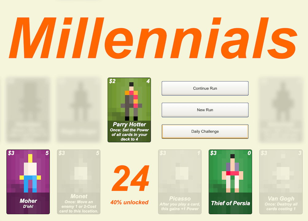
The collection view is built right into the title screen.
Initially, the collection was a separate view that you had to navigate to, just like the New Run and the Daily Challenge are. However, we wanted to make the meta-progression more prominent, and to instantly hook players on the idea of collecting cards. It's a game about collecting cards—let's make it clear from the get go. That's why we built the collection right into the title view. As soon as you launch the game, you're presented with a live gallery of all cards and two numbers: how many cards you have seen and how many you have unlocked by purchasing them in the market. To add some mystery, cards that are neither are greyed out and blurred, so that the name and the pixel art are not visible.
In a true roguelike fashion, unlocking a card doesn't affect the gameplay. Instead, the unlocked percentage is a proxy for how much of the game you have experienced and are familiar with. Getting better at the game is a meta-progression of its own.
Millennials
Create powerful synergies with only 12 cards in your deck.
| Status | In development |
| Author | Piesku.com |
| Genre | Card Game |
| Tags | Deck Building, Roguelike |
| Languages | English |
More posts
- Weeknotes 32Nov 03, 2024
- Changelog 31Oct 21, 2024
- Card-a-Monday, Episode 2: Magic GingerOct 14, 2024
- Changelog: Week 30Oct 08, 2024
- Card-a-Monday, Episode 1: Johny AlphaOct 07, 2024
- Changelog: Week 29Oct 02, 2024
- js13k part 1: IntroductionOct 01, 2024

Leave a comment
Log in with itch.io to leave a comment.